There's a reason cursive handwriting has had a quiet revival in the last few years. People who grew up typing everything are suddenly realising they want to be able to write a card, sign their name with something other than a scrawl, or keep a journal that doesn't look like a ransom note. And they're googling "how to write cursive letters" in their millions.
If that's you — welcome. This guide was written specifically for people who weren't taught cursive properly the first time around, or were taught it and forgot most of it, or learned a version of it that they've never been happy with. It covers every letter A to Z, both uppercase and lowercase, with honest stroke-by-stroke guidance and none of the glossy vagueness that makes most cursive tutorials useless.
One thing upfront: cursive is a physical skill. You can read this entire guide in twenty minutes, understand it completely, and still not be able to write cursive well. What this guide gives you is the right knowledge — the stroke sequences, the common errors, the practice structure. Your hand then has to do the work of building the muscle memory. That part takes weeks, not hours. Be patient with yourself.
- Why Learn Cursive? (And Why Now Is a Good Time)
- Before You Write a Single Letter — Grip, Posture, and Paper
- The Foundation Strokes — What All Cursive Letters Are Built From
- Lowercase Cursive Letters a–z — Full Stroke Guide
- Uppercase Cursive Letters A–Z — Full Stroke Guide
- Joining Letters — How Cursive Connections Actually Work
- Practice Sentences for Every Letter
- Your 7-Day Weekly Cursive Practice Schedule
- The 7 Most Common Cursive Mistakes and How to Fix Them
- Realistic Progress Timeline
- Frequently Asked Questions
Why Learn Cursive? (And Why Now Is a Good Time)
I'm not going to spend three paragraphs insisting that cursive makes you smarter or that screens are destroying civilisation. Those arguments have been made, and they're only partly true. Here's what's actually practical about cursive in 2026:
Speed. Fluent cursive — genuinely fluent, not half-remembered loops with random print letters thrown in — is faster than print. The pen rarely leaves the paper, which means less dead time between letters. For anyone who takes handwritten notes, keeps a journal, or writes at length, that efficiency matters.
Signature confidence. A significant number of adults who want to learn cursive just want a proper signature. They've been signing their name with a squiggle for years and they're vaguely embarrassed by it. That's a completely legitimate reason to learn cursive, and this guide will help with that too.
Reading historical documents. If you're interested in history, genealogy, or old letters, a lot of primary sources are handwritten in cursive. Being able to read them fluently — not laboriously decipher them — is genuinely useful.
The mindfulness angle. A lot of people who've taken up cursive in the last few years describe it the way they describe meditation: slow, deliberate, completely absorbing. It's hard to think about anything else while you're concentrating on forming letters correctly. There are worse ways to spend fifteen minutes of a morning.
Before You Write a Single Letter — Grip, Posture, and Paper
Cursive is more sensitive to grip and posture than print. The reason is simple: cursive letters are formed with continuous, flowing strokes — and tension anywhere in your hand, wrist, or arm interrupts that flow immediately. A tense grip produces jerky, uneven cursive. A relaxed grip produces the smooth, consistent lines that make cursive look the way it's supposed to.
Grip
Use the tripod grip: pen held between the tip of the thumb and the side of the index finger, resting on the middle finger about 2.5–3cm from the nib. Most importantly — hold it lightly. The pen should be able to be removed from your hand with a gentle pull. If you're gripping hard enough that your fingertips pale, loosen up immediately. That tension is actively working against you.
Posture and paper angle
Your forearm should rest on the desk from elbow to wrist — not float above it. The large forearm muscles should be driving the movement, not just the fingers. Tilt your paper 30–45 degrees — slightly more than for print. This angle means your natural hand movement runs parallel to the slant of cursive letters, which reduces effort and produces a more consistent, natural-looking slant without having to consciously think about it.
Paper and pen
For cursive, lined paper with 8–10mm ruling is ideal at the start. A smooth-writing gel pen or fountain pen works much better than a cheap ballpoint — you want the pen to glide, not drag. A pen that requires pressure will fight your grip every time.
Here's something most people don't know: the best cursive writers move their arm across the page as they write — not just their fingers. The arm slides smoothly to the right with each word, while the fingers handle the individual letter shapes. This is why cursive looks effortless when someone has genuinely mastered it. If your hand is staying still and only your fingers are moving, you'll tire quickly and your letters will become cramped.
The Foundation Strokes — What All Cursive Letters Are Built From
Before you practise a single letter, spend your first three practice sessions on just these six strokes. I know this sounds overly patient. Do it anyway. Every letter in the cursive alphabet is a variation or combination of these movements. If these feel smooth, your letters will come much more naturally. If you skip them, you'll be fighting the basics every time you try something complex.
Lowercase Cursive Letters a–z — Full Stroke Guide
Lowercase letters are where you should spend 80% of your practice time. They're what you use in almost everything you write. I've grouped them by the dominant stroke they share, because learning them in groups is faster and more efficient than going through the alphabet in order.
Group 1 — Oval-Based Letters Easiest
These are built primarily from the oval stroke. Start here — master these first and the rest of the alphabet becomes easier.
The cursive a looks almost identical to the print a in many styles — this makes it one of the most reassuring letters to start with. Begin with a small upswing from the baseline, loop anti-clockwise into an oval, come back down the right side of the oval, and then sweep right along the baseline with an undercurve exit that will connect to the next letter.
- Start just above the baseline — upswing left and up
- Loop anti-clockwise to form the oval body
- Close the oval by coming down the right side to baseline
- Exit right with a gentle undercurve upswing
Common mistake: Leaving the oval open at the top, which makes the letter look like a u. Close it fully.
The simplest letter in cursive. Begin with an upswing from the baseline, curve anti-clockwise into the top of the oval — but don't close it. Leave the right side open. The exit stroke is a very gentle upward curve to the right, ready to connect to the next letter.
- Upswing from baseline to midline
- Curve anti-clockwise — top, left, bottom
- End with a small upward curve exit (don't close the letter)
Common mistake: Closing the c into an o. Keep the right side deliberately open.
Same oval as a, but after closing the oval at the right side, instead of a short exit you continue upward all the way to the top line (where ascenders live), then come back down with a smooth stroke to baseline, then exit right. The ascender should be twice the height of the oval body.
- Form the oval exactly as in a
- At the right side of the oval, continue up to the top line
- Retrace back down to the baseline
- Exit with undercurve right
Common mistake: The ascender is too short. In cursive, d's ascender should clearly reach the top guideline — not hover halfway.
The oval is the same as a — but instead of exiting right along the baseline, you continue below the baseline into a descender loop that swings left and comes back up to the baseline, exiting right. The loop should sit neatly in the descender zone (below the baseline) and close cleanly.
- Form the oval (same as a)
- At the right side of the oval, continue down below the baseline
- Loop left in the descender zone
- Swing back up to baseline and exit right
Common mistake: The descender loop doesn't close — it stays open like a fishhook. The loop should swing all the way back and cross itself cleanly.
An oval, fully closed, with a small exit loop at the top right where the pen leaves the letter. Unlike print o, cursive o has a connecting stroke — a small overcurve exit at the top right that flows into the next letter. This exit is what most beginners miss.
- Begin with an upswing — loop anti-clockwise into the oval
- Close the oval fully at the top
- Continue with a small exit loop curving right at the top
Common mistake: Writing cursive o the same way as print o — with no exit stroke. The connection to the next letter exits from the top, not the bottom right.
The oval is the same as before — but q's descender is a straight downstroke with a small upward hook at the bottom, rather than a loop like g. The straight descender is what distinguishes q from g at a glance.
- Form the oval
- Descend straight below the baseline
- Add a small rightward hook at the bottom
Group 2 — Loop Letters (Ascenders) Medium
These letters have tall looped strokes that reach the top guideline. Height consistency across this group is one of the most visible quality markers in cursive.
Begin with an upswing all the way to the top line. Loop to the right (clockwise) coming back down. At the baseline, swing right into a small bowl shape — like a lower-case a without the top oval — and exit with an undercurve. This is the one letter where the loop goes clockwise, not anti-clockwise.
- Upstroke from baseline to top line
- Loop clockwise and come back down
- At baseline, form the bowl (like a small bump to the right)
- Exit right with undercurve
Common mistake: Making the loop anti-clockwise (which produces a shape closer to l). The b loop swings to the right.
Upswing to the top line, anti-clockwise loop back down, and then — without lifting the pen — a smooth arch forward at midline height, coming down to the baseline and exiting right. The arch is the same shape as the top of a print letter n.
- Upstroke to top line
- Anti-clockwise loop back to baseline
- Arch up to midline height and back down
- Exit with undercurve right
Upstroke to top line, anti-clockwise loop, back down to baseline — same as h to this point. Then, instead of an arch, the pen makes a small diagonal forward stroke to midline and then swings back to the right — the characteristic "kick" of a cursive k.
- Upstroke and anti-clockwise loop (same as h)
- At baseline, angle up-right to midline height
- Swing right back down to baseline
- Exit with undercurve
Common mistake: The kick starts too high or too low — it should extend to midline height only, not as high as the loop.
Probably the simplest loop letter. Upstroke all the way to the top line, anti-clockwise loop back down to the baseline in one continuous oval, and then a smooth undercurve exit to the right. The whole letter is essentially one elongated oval loop.
- Upstroke from baseline to top line
- Anti-clockwise loop all the way back to baseline
- Exit right with undercurve
Common mistake: Making the loop too wide. Cursive l should be narrow — almost like an elongated teardrop, not a wide oval.
The most complex lowercase letter. The f has both an ascender loop (above the midline) and a descender (below the baseline), plus a crossbar at the midline. Start above the baseline, loop anti-clockwise up to the top line and back down, continue past the baseline into the descender zone (no loop — just a gentle curve left), come back up through the baseline, and then add the crossbar after finishing the main stroke.
- Start slightly above baseline — go up to the top line in an anti-clockwise loop
- Come back down through the midline to the baseline
- Continue below the baseline with a leftward descender curve
- Swing back up to the baseline
- Add the crossbar at the midline as a separate stroke
Common mistake: Crossing too high or too low. The crossbar sits at the midline — the same height as the top of your short letters.
Group 3 — Arch Letters Medium
Built from the overcurve and undercurve alternation. Get the rhythm of these and your cursive will start to look genuinely fluid.
Begin with an upswing from baseline to midline. Then two identical arches — overcurve up to the midline, back down to the baseline, overcurve again, back down, and exit right. The three humps of m should all be exactly the same height and width — consistency here is what makes m look polished.
- Upswing from baseline to midline
- First overcurve arch down to baseline
- Second overcurve arch down to baseline
- Exit with undercurve right
Exactly like m but with one arch instead of two. Upswing from baseline to midline, one overcurve down to baseline, exit right. The simplicity of n makes it one of the best letters to use when checking your arch consistency — how even is your arch? How does its height compare to your m?
The undercurve version of n. Upswing to midline, curve down and under to the right (undercurve), swing back up to midline, curve down and under again, exit right. Think of it as two undercurves back to back, sharing the middle upstroke.
Group 4 — Diagonal Letters Hard
These require precise slant control. Consistency of angle across all your diagonal strokes is what keeps these looking intentional rather than messy.
Begin with an upswing to midline. Slant down-right to the baseline. Slant up-right back to midline. Exit with a small overcurve. In cursive, the v is slightly rounded at the bottom — not as sharp as a print v. Both diagonal strokes should be at the same angle.
The w is a double v: upswing, down, up, down, up — five strokes forming four diagonal segments. All four diagonals must be the same angle and length. A common problem is that the second v collapses into the first, making the letter look more like a compressed u. Keep the segments distinct and consistent.
One of the few lowercase letters requiring a pen lift. First stroke: upswing to midline, then diagonal down-right to baseline. Second stroke (after lifting): diagonal from top-right to bottom-left, crossing the first stroke at midpoint. Exit from the second stroke curves right at baseline. The crossing point should be at the middle of the letter height.
Upswing to midline, first diagonal down, swing back up to midline — that's the v-top. Then instead of exiting right, continue down past the baseline into a wide descender loop that swings left and comes back up through the baseline. The descender loop of y is wider than g's — it sits fully in the descender zone.
Common mistake: Closing the descender loop too tightly, which squishes it. The y loop should be open and wide.
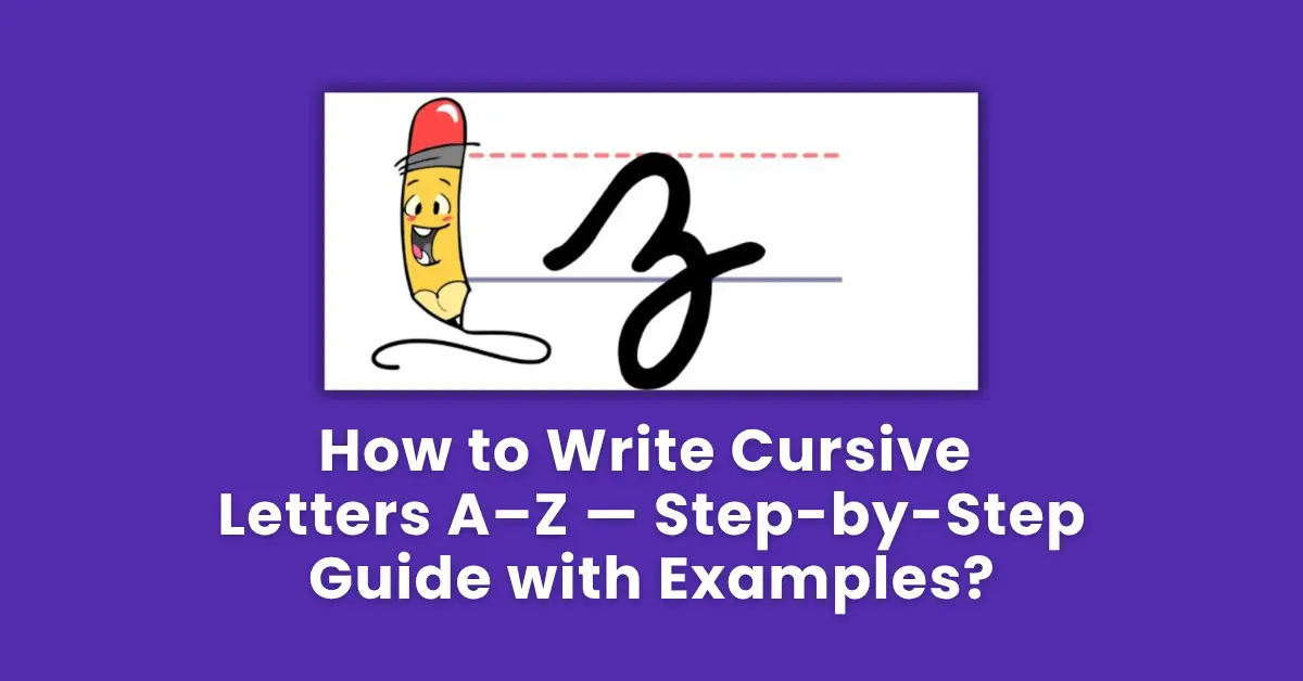
Upswing to midline, horizontal stroke right, diagonal down-left to baseline, horizontal stroke right, then loop down into the descender zone and back up. The cursive z has a distinctive descender loop that print z lacks entirely. Give this letter extra practice time — it's genuinely unfamiliar.
Group 5 — The Remaining Lowercase Letters
Not every letter connects to the next without lifting the pen. The letters that commonly need a pen lift before the next letter are: b, g, j, p, q, s, x, y, and z. Additionally, you always lift the pen after dotting i and j, and after crossing t and f. Beginners often try to force connections where none should exist, which creates awkward, tangled joins. When in doubt about whether a join works — lift the pen. A clean lift looks better than a forced connection.
Uppercase Cursive Letters A–Z — Full Stroke Guide
Here's an honest truth about uppercase cursive letters: they're harder than lowercase, they're used far less frequently, and they're the most variable across different cursive styles. What looks like an uppercase F in one style bears almost no resemblance to an uppercase F in another. This guide describes the most widely taught versions — but if you find a specific uppercase letter that you genuinely can't make work, it's completely acceptable to substitute your print capital letter instead. Many proficient cursive writers do this for a few tricky capitals.
That said, learning the "proper" cursive capitals is worth the effort — they have an elegance that print capitals simply don't, and using them correctly elevates the entire appearance of your handwriting.
The Trickiest Uppercase Letters — Detailed Guides
Cursive capital F begins with a small loop at the top, curves down in a wide arc to the left and then sweeps right at the baseline — like a wide, flattened J. Then a second stroke adds the arm: a horizontal bar from left-to-right at midline height. Many beginners try to draw a print F shape, which looks completely wrong in cursive. Let go of the print version entirely.
Uppercase cursive G looks like an ornate, wide S with an extra flourish. Start at the top with a backward loop, sweep down and right into a wide arch at baseline, then the exit stroke sweeps right with an upward tail. This is one of the letters where different cursive styles diverge the most — find one version you like and commit to it consistently.
Cursive uppercase Q is perhaps the most surprising letter in the entire alphabet. It looks exactly like a number 2 with a tail. Start at the top, curve left and down in a wide arc, swing right at the baseline, curve up and right with an exit. Many teachers permit students to use a stylised print Q if the cursive version causes confusion — but the cursive version, once learned, is actually quite quick to write.
Start your uppercase practice with C, O, L, I, J, T, and U. These are the uppercase letters most similar to their lowercase counterparts, and they'll build your confidence before you tackle the genuinely unfamiliar shapes like G, F, Q, and Z.
Joining Letters — How Cursive Connections Actually Work
Here's where cursive actually becomes cursive. Individual letters are just the vocabulary — joining them is the grammar. And it's the part that most guides skip over in a paragraph or two, which is a disservice to anyone actually trying to learn.
The majority of cursive joins work one of three ways:
The 10 Most Important Letter Combinations to Practise
| Combination | Join Type | Why It Matters | Practice Word |
|---|---|---|---|
| th | Undercurve | One of the most common letter pairs in English | the, this, that, there |
| an | Undercurve | Appears constantly in everyday writing | and, plan, hand, stand |
| ou | Top join from o | Top join — the awkward one beginners struggle most with | out, your, about, found |
| er | Undercurve | Extremely common in English suffixes | after, under, her, were |
| in | Undercurve | Common prefix and inside word combination | into, kind, mind, winter |
| on | Top join from o | Another top join that catches beginners off guard | on, gone, done, stone |
| re | Undercurve | Very common prefix | read, write, great, every |
| me | Overcurve | Tests the overcurve-to-undercurve join | me, time, name, came |
| st | Undercurve | Common combination that tests t crossbar placement | street, last, must, just |
| wh | Top join from w | Unusual starting combination — tests w's top exit | what, when, where, which |
For each join combination you want to practise, pick five real words that use it and write each word ten times in a session. Real words are more motivating than abstract letter pairs, and they give your hand the join in context — which is closer to how you'll actually use it. The words above are a good starting list.
Practice Sentences for Every Letter
These sentences are curated specifically for cursive practice. They're longer than typical beginner sentences, contain a good spread of letter combinations and join types, and are meaningful enough that you won't lose your mind writing them for the eighth time. Write each one 8–10 times per session, focusing on one quality (join consistency, letter height, or baseline adherence) per repetition.
Type any of these sentences into Handwriting Repeater to generate a structured practice format — it lets you repeat a sentence as many times as you need and tracks your focus for each session. It's particularly effective for cursive because you can target specific join combinations by choosing sentences that feature them prominently.
Your 7-Day Weekly Cursive Practice Schedule
Consistency is the only thing that actually works. Here's a concrete seven-day structure you can start this week. Each session is 15 minutes maximum. Do not go longer — the quality of attention matters far more than time spent.
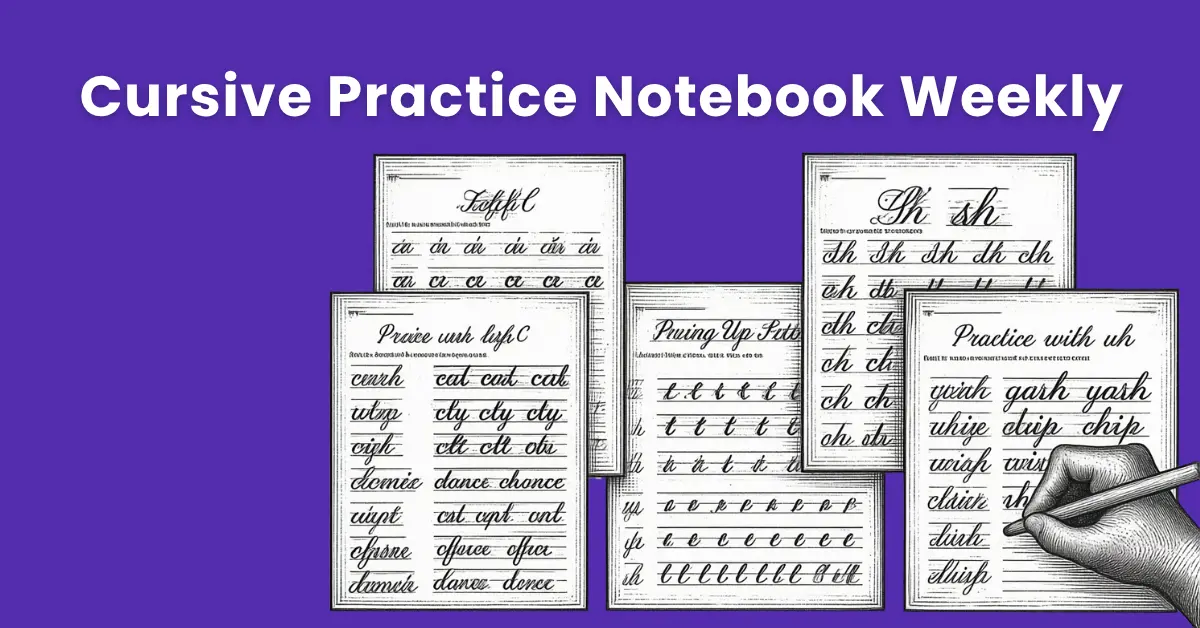
A week's worth of cursive practice in a dedicated notebook — the progression from Monday to Sunday is visible when sessions are dated and consistent.
The 7 Most Common Cursive Mistakes and How to Fix Them
Some letters lean forward, some are upright, some lean back — all in the same word. This is the single most common problem in adult cursive, and it makes writing look chaotic even when individual letters are well-formed. Fix: tilt your paper more (30–45 degrees) so your natural hand movement produces a forward slant automatically. Then consciously check every fifth word for slant consistency.
Loops in letters like l, b, h, k, and f should be narrow — barely wider than the downstroke. Beginners tend to make them wide and round, which produces a childish, uncontrolled look. Fix: practise individual loop strokes until narrow loops feel natural, then apply that to the full letters.
Trying to connect every single letter without lifting the pen produces tangled, unreadable joins. Some letters are not meant to connect directly to the next one. Fix: learn which letters require a pen lift (b, g, j, p, q, s, x, y, z) and practise lifting cleanly. A deliberate pen lift is not a failure — it's correct technique.
Short letters (a, c, e, i, m, n, o, r, s, u, v, w, x) all need to be the same height. Tall letters (b, d, f, h, k, l, t) need to be consistently taller. Descenders (g, j, p, q, y, z) need to extend consistently below the baseline. When these three zones are kept consistent, the overall appearance of your cursive improves dramatically. Fix: use lined paper with clear guidelines until your sizing becomes automatic.
This sounds childishly obvious, but in the flow of cursive, these additions are easy to omit — especially when you're concentrating on getting the joins right. Fix: develop the habit of going back across a word after writing it to add all crossbars and dots before moving to the next word. Do this consistently until it becomes automatic.
Speed is the reward you earn after six to eight weeks of careful practice — not something to attempt during the first two weeks. Beginners who rush produce sloppy cursive and reinforce bad habits through repetition. Fix: write at roughly half your natural print speed during the first month of cursive practice. Let speed come on its own as the forms become automatic.
Writing ten lines of cursive and never looking at them is essentially useless. The review — comparing the tenth line to the first, identifying what changed, noting what still needs work — is where the actual learning happens. Fix: after every five lines, stop. Look at all five. Compare them. Identify your one weakest element. Focus on that element for the next five lines.
Realistic Progress Timeline
I want to be completely transparent about timelines, because unrealistic expectations are what cause most people to give up on cursive after two weeks convinced they "can't do it." They can. They just underestimated how long the foundations take.
✅ Key Takeaways — How to Write Cursive Letters A–Z
- Learn lowercase before uppercase — lowercase is 95% of everything you'll write.
- Master the six foundation strokes before tackling individual letters — everything else is built from these.
- Group letters by stroke type, not alphabetical order. Oval letters first, then loops, then arches, then diagonals.
- Not every letter connects to the next — learn which ones require a pen lift and use it without shame.
- Paper angle (30–45 degrees) automatically produces consistent forward slant. Use it.
- 15 minutes daily beats 2 hours on weekends, every time, for motor skill development.
- Expect basic fluency in 6–8 weeks. Genuine fluency in 3–4 months. Don't stop at the first sign of improvement.
✍️ Practice Cursive on Handwriting Repeater Today →