Calligraphy for Beginners — How to Start from Zero Using Free Online Tools
You don't need expensive supplies or a calligraphy class to start. A pencil, some paper, and a clear method are enough.
Let me be honest with you about something most calligraphy articles won't say: the reason most people give up in the first week has nothing to do with talent. It's because they started in the wrong order — buying a dip pen before they understood the basic strokes, or trying to copy complex flourishes before their simple letters were consistent. They got frustrated, told themselves they "just weren't artistic," and put the pens in a drawer.
I've seen this pattern enough times to know it's almost always a method problem, not a talent problem. Calligraphy is a motor skill, which means anyone who can hold a pen can learn it — it just needs the right sequence. This guide is that sequence. We'll go from the absolute basics (what calligraphy actually is, which style to start with, what you genuinely need to buy) through to building a daily practice that produces visible results within weeks, not months.
We'll also cover the free online tools that make this significantly easier than it was even five years ago — including how to use the calligraphy font feature on Handwriting Repeater to give yourself a clear, copyable model for every letter you practise.
- What Is Calligraphy — and Why It's Not What Most People Think
- The 6 Best Calligraphy Styles for Beginners (Ranked by Difficulty)
- What You Actually Need to Start — The Honest Supplies List
- The 6 Basic Calligraphy Strokes (Learn These Before Any Letters)
- Step-by-Step: How to Do Faux Calligraphy Right Now
- Free Online Tools That Actually Help Beginners
- A 4-Week Beginner Practice Plan
- The 7 Mistakes That Stall Beginners (and How to Avoid Them)
- Frequently Asked Questions
What Is Calligraphy — and Why It's Not What Most People Think
The word "calligraphy" comes from the Greek kallos (beauty) and graphia (writing). In practice, it means writing that has been made intentionally beautiful — where the visual quality of the letters themselves is part of the message. That's the only definition that matters at the beginner stage, because it tells you something important: calligraphy is about letters, not flourishes.
Most people's mental image of calligraphy is something like a Victorian wedding invitation — elaborate curls, dramatic thick-thin contrast, letters flowing into each other like water. That's real calligraphy, but it's advanced calligraphy. The gap between "I've never tried this" and "that Victorian invitation" is large but not mysterious. It's just a sequence of learnable skills, each building on the last.
What makes calligraphy feel different from ordinary handwriting is the consistent variation between thick and thin strokes. In regular writing, your pen applies the same pressure throughout a letter. In calligraphy, downstrokes (moving toward you, from top to bottom) are thick, and upstrokes (moving away from you, from bottom to top) are thin. That single principle — thick down, thin up — is the entire foundation of almost every Western calligraphy style. Once your hand has learned that rhythm, everything else is a variation on it.
Before you pick up a pen, say this out loud: "Thick down, thin up." Write it on a Post-it and stick it to your desk. Every time your calligraphy looks wrong, this is almost certainly the principle you've violated. Downstrokes — thick. Upstrokes — thin. Internalize this before worrying about anything else, and you'll be ahead of 80% of people who try to learn calligraphy.
The 6 Best Calligraphy Styles for Beginners (Ranked by Difficulty)
Picking the right first style is probably the single most important decision a beginner makes. Choose something too advanced (Copperplate with a dip pen is a common mistake) and you spend weeks fighting the tool before you've understood the letters. Start with something appropriate and you see real results in days.
Here's a straightforward ranking of the six most popular styles, from easiest to hardest for an absolute beginner:
The six main beginner calligraphy styles — from the tool-free Faux Calligraphy on the left to the more complex Uncial on the right.
This is where every beginner should start, no exceptions. Faux calligraphy uses any pen you own — a biro, a felt tip, a pencil. You write normally, then go back and thicken every downstroke by adding a second line alongside it and filling it in. The result genuinely looks like calligraphy. More importantly, it trains your eye to see the thick-thin contrast before your hand has to produce it automatically. Spend at least one week here before touching any special pen.
Modern brush lettering is the style you've seen all over social media, on kraft paper gift tags, chalkboard menus, and wedding place cards. It uses a brush pen — a felt or fibre-tip pen with a flexible tip that creates thick lines with pressure and thin lines without. It's more forgiving than a traditional dip pen (no ink bottles, no scratchy nibs) and produces very satisfying results quickly. The Tombow Dual Brush Pen or a Pentel Sign Pen Touch are the standard beginner brush pens — both under £6.
Italic calligraphy (also called chancery italic) is a slanted, slightly compressed style that was developed in Renaissance Italy and became the standard script for educated writers across Europe for centuries. It's excellent for beginners because the letterforms are simple and logical, the tool is forgiving (a broad-edge italic nib or even a felt italic pen), and the style looks elegant without requiring elaborate flourishes. This is the style most commonly taught in adult calligraphy evening classes.
Copperplate is what most people picture when they think "calligraphy" — the flowing, looped, highly contrasted script of Victorian correspondence. It uses a flexible pointed nib dipped in ink, and the thick-thin contrast comes from applying pressure on downstrokes to splay the nib, then releasing pressure on upstrokes. It's beautiful but unforgiving: the nib catches on paper, ink flow needs constant management, and the muscle control required is significant. This is the style to work toward, not start with. Once you've done two to three months of faux calligraphy and brush lettering, you'll be ready to appreciate it properly.
Gothic calligraphy (also called Blackletter, Textura, or Old English) produces the dense, angular text you see in medieval manuscripts, German beer labels, and heavy metal band logos. It's written with a broad-edge nib held at a consistent 45-degree angle, which automatically creates thick and thin strokes without pressure variation. The letterforms are geometric and precise — less intuitive than italic but satisfying to construct once you've understood the system. Excellent for beginners who want a striking, unusual style.
Uncial is the rounded, majuscule (all-capitals) script used in early Christian manuscripts like the Book of Kells. It predates the distinction between upper and lower case and has a warm, organic quality unlike any other style. Written with a broad-edge nib, it's actually relatively accessible to beginners because the letterforms are simple and round, and the nib angle is consistent throughout. It's a niche style but one that beginners with an interest in history or Celtic design often find deeply satisfying.
What You Actually Need to Start — The Honest Supplies List
There's an entire industry built around selling beginners expensive calligraphy equipment before they're ready for it. Here's what you actually need at each stage, with prices that reflect what things genuinely cost.
| Stage | What You Need | Estimated Cost | Notes |
|---|---|---|---|
| Week 1–2 (Faux Calligraphy) | Any pen or pencil + printer paper | £0 | Use what you already own. This is intentional. |
| Week 3–4 (Brush Lettering) | 1 brush pen + smooth paper | £5–£10 | Tombow Fudenosuke or Pentel Sign Pen Touch recommended |
| Month 2 (Italic) | Beginner italic pen set (e.g. Staedtler Calligraph Duo) | £8–£15 | These have pre-set nib angles — great for learning |
| Month 3+ (Dip pen) | Basic dip pen holder + Nikko G nib + black ink | £12–£20 | Only when you're ready. Not before. |
| Paper (any stage) | Rhodia dot-grid pad or smooth printer paper | £0–£7 | Avoid textured or rough paper — it catches the nib |
Almost every calligraphy "starter kit" sold online includes a dip pen, multiple nibs, coloured inks, and a workbook — for £25–£40. It looks compelling and feels like a good investment. It almost always isn't. The dip pen requires more control than a beginner has, the nibs rust quickly if not dried properly, and the workbook's letter models are often poorly drawn. Buy one brush pen and practice with it for four weeks. Then reassess.
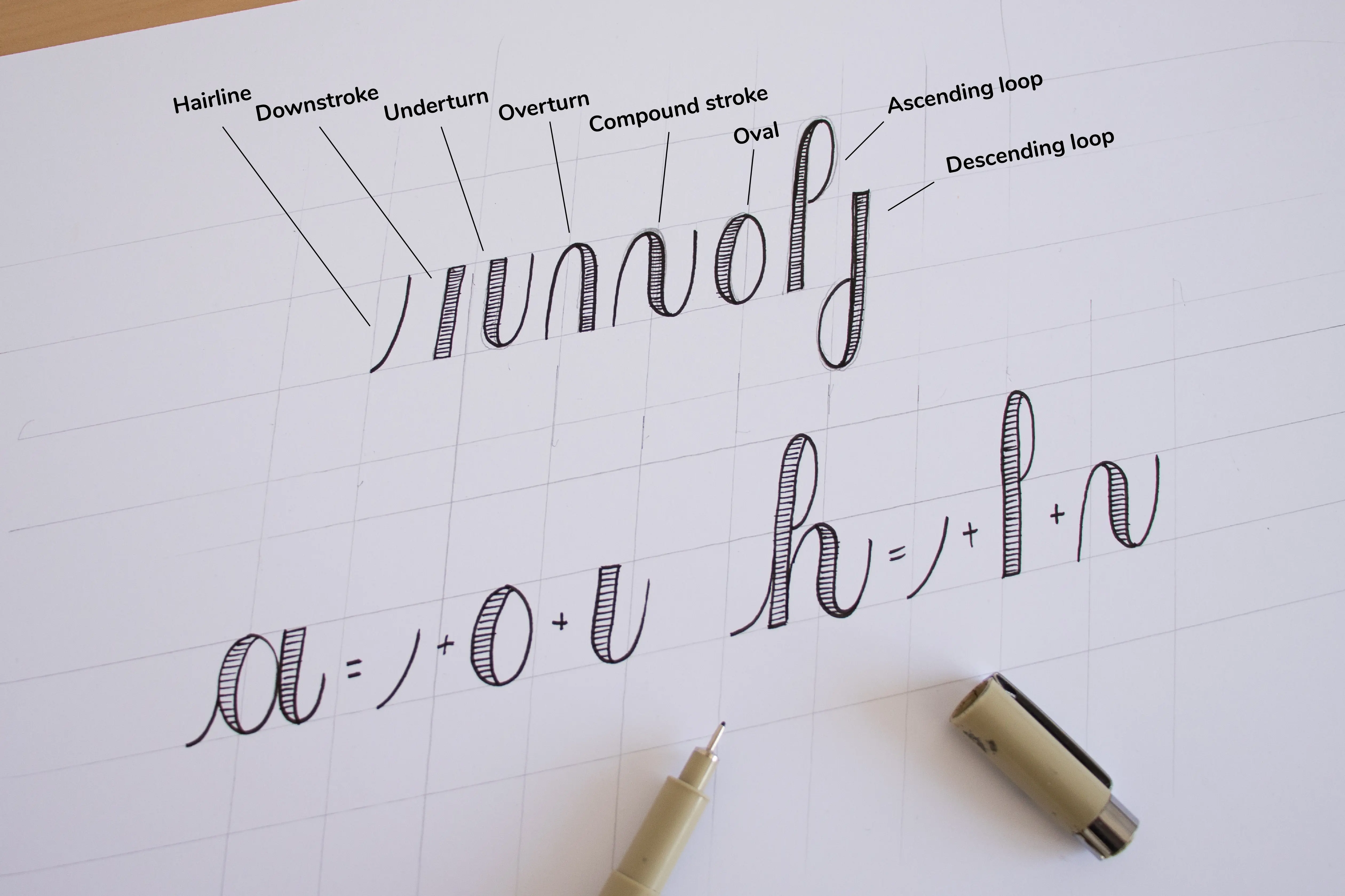
The 6 Basic Calligraphy Strokes (Learn These Before Any Letters)
Every letter in every calligraphy style is assembled from a small set of basic strokes. Learning the strokes before the letters is not a beginner shortcut — it's genuinely how professional calligraphers think about the craft. Once your hand knows these six movements, the full alphabet becomes recognisable patterns rather than thirty-plus separate things to memorise.
Fill two or three lines with each stroke before moving to the next. Don't rush through them — the goal is consistency, not speed. Each stroke should look the same as the last. If they don't, slow down. When all six strokes are consistent, you're genuinely ready to start the alphabet. Most beginners who skip this step regret it within two weeks; most beginners who don't skip it are astonished by how quickly the letters come together.
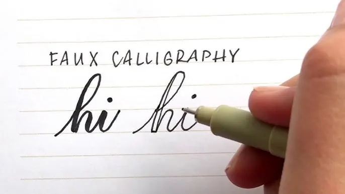
Step-by-Step: How to Do Faux Calligraphy Right Now
Faux calligraphy is the single best way to understand what calligraphy is — before committing to any tools, any style, or any significant time investment. Here's exactly how to do it, right now, with whatever pen is nearest to you.
Faux calligraphy in three steps: write normally, identify downstrokes, thicken and fill them in.
Free Online Tools That Actually Help Beginners
The internet has made calligraphy education dramatically more accessible than it was ten years ago. But there's a lot of noise — Pinterest boards full of aspirational images that don't teach you anything, YouTube tutorials that skip the foundational steps. Here are the tools and resources that genuinely move beginners forward.
The calligraphy font feature on Handwriting Repeater lets you type any word, phrase, or sentence and see it rendered in a calligraphy style. This is more useful than it might sound: one of the hardest things about learning calligraphy is not knowing what "correct" looks like for the specific letter you're struggling with. Having a clean, high-quality model on your screen that you can copy from takes the guesswork out entirely.
The best way to use it: type the letter or word you're currently practising, scale it up so you can see the thick-thin contrast clearly, then write the same letter ten times on paper trying to match what you see. Then check. Then write ten more. This is essentially the same workflow professional calligraphers use when learning a new style, just with a digital model instead of a printed exemplar.
YouTube is the best free resource for watching technique in real time — you can see how a calligrapher holds the pen, how much pressure they apply, how quickly they move, and how they correct mistakes. The challenge is finding tutorials that are actually structured for beginners rather than just impressive to watch. Look for channels that show close-up footage of the pen on paper and explain the "why" behind each stroke, not just the "what." Channels focused on one style tend to be more useful than generalist calligraphy channels for beginners.
Most established calligraphy communities (including many on Reddit's r/Calligraphy and various Instagram calligraphy accounts) offer free downloadable practice sheets — lined grids specifically designed for calligraphy with slant lines, x-height guides, and ascender/descender space built in. These are genuinely superior to plain lined paper because they give you consistent guides without having to draw them yourself. Search for "calligraphy practice sheet free PDF" plus the name of your chosen style (e.g. "copperplate practice sheet free PDF").
If you have an iPad and Apple Pencil, Procreate with a calligraphy brush is an excellent supplement to paper practice. It won't replace real pen-on-paper muscle memory, but it's useful for experimenting with letterforms before committing to ink, for understanding composition (how calligraphy words and phrases are arranged on a page), and for generating reference material. The app itself is a one-time purchase of around £12 — not free, but the only cost in an otherwise zero-hardware digital calligraphy setup.
Instagram and Pinterest are genuinely useful for seeing what experienced calligraphers produce — they calibrate your aesthetic sense and give you long-term goals to work toward. But they're not substitutes for structured practice resources. Follow calligraphers whose work you find beautiful; use their output as inspiration, not as a curriculum. The gap between a beginner's first month and a professional's polished post can look enormous on social media — more enormous than it actually is — because platforms reward finished pieces, not process. Don't use Instagram to benchmark your progress. Use it for motivation, and use structured practice for actual improvement. Also see our guide on digital vs paper practice for a deeper look at how to balance both approaches.
A 4-Week Beginner Practice Plan
This plan assumes 15–20 minutes of daily practice. It's based on the sequence that produces the most consistent results for beginners — starting with faux calligraphy and moving toward brush lettering. If you have less time, halve each session but keep the daily frequency; consistency matters far more than session length for motor skill development.
Always spend the first three to five minutes of every session writing basic upstrokes and downstrokes — not letters, just strokes. This is the calligraphy equivalent of a musician playing scales before a practice session. It loosens the wrist, resets the pressure intuition, and dramatically reduces the tension-related shakiness that makes early calligraphy look unprofessional. Every session, every time, no exceptions — this single habit separates calligraphers who improve steadily from those who plateau.
The 7 Mistakes That Stall Beginners (and How to Avoid Them)
These aren't obvious mistakes — if they were, people wouldn't keep making them. Each one is the kind of thing that feels reasonable at the time and only reveals itself as a problem a few weeks in. Knowing them upfront saves you a lot of frustration.
Most calligraphy mistakes trace back to one of seven causes. Recognising them early is worth weeks of frustrated practice.
Frequently Asked Questions About Calligraphy for Beginners
Can I learn calligraphy on my own without a class?
Yes — completely. The vast majority of calligraphers alive today are self-taught, and the resources available now (free YouTube tutorials, font generators, printable practice sheets) are better than most paid courses were ten years ago. The key is structured practice: don't just copy randomly; work through strokes, then individual letters, then words, in that order. Patience matters more than talent.
What is the easiest calligraphy style for absolute beginners?
Faux Calligraphy is the easiest starting point because it requires no special pen whatsoever. You write in your normal handwriting, then manually thicken the downstrokes with any pen or pencil you own. It teaches you the visual logic of calligraphy — thick down, thin up — before you invest in any equipment. Modern Brush Lettering with a brush pen is the next natural step up once your eye has understood that thick-thin principle.
Do I need expensive calligraphy pens to start?
No — and this deserves to be said clearly. You can start with a regular pencil and practise faux calligraphy for weeks before buying anything at all. When you're ready for real tools, an entry-level brush pen costs around £5–8 and is all you need for months of productive practice. Expensive dip pens and premium nibs are for people who've already built the muscle memory — buying them before you can form consistent letters is a very common and genuinely costly beginner mistake.
How long does it take to learn calligraphy?
With 15–20 minutes of daily practice, most beginners can form recognisable calligraphy letters within 2–3 weeks and write simple words consistently within 6–8 weeks. Calligraphy as a craft never really stops developing — professionals still refine their technique after decades — but the point where your work starts looking genuinely impressive to other people comes much sooner than most beginners expect. The biggest accelerator is daily short sessions rather than occasional long ones.
What paper is best for calligraphy practice?
For beginners, smooth cartridge paper or standard printer paper works completely fine. The important thing is to avoid heavily textured paper — it catches pen nibs and brush tips, creating rough, ragged lines that look nothing like real calligraphy even when your technique is good. Dot-grid paper (Rhodia or Leuchtturm brands are popular) is excellent because the dots help you maintain consistent letter height without the visual clutter of full lines. Many calligraphers practise on plain printer paper placed over a printed grid guide underneath.
Is calligraphy the same as handwriting?
Not quite, though they're related. Handwriting is fundamentally functional — its job is communication, and legibility is the main standard. Calligraphy is decorative — its job is visual beauty, and communication is secondary to aesthetics. That said, learning calligraphy almost always improves your everyday handwriting because it forces you to think consciously about letterforms, spacing, and consistency in ways that normal handwriting practice skips over. The two skills complement each other naturally, which is part of why improving your handwriting and learning calligraphy often go hand in hand.
Can I use digital tools to practise calligraphy?
Yes, and they're genuinely underrated as learning aids. Font generators — like the calligraphy style available on Handwriting Repeater — let you see exactly how a word should look in a given style, giving you a clear target to copy. This is particularly useful for beginners who don't yet have the trained eye to judge whether their own letterforms are correct. Use the digital tool to generate a model, keep it on screen or print it, then copy it by hand. The digital reference and the physical practice work together rather than competing.
What are the basic calligraphy strokes I need to learn first?
Every calligraphy style is built from a small set of fundamental strokes: the upstroke (thin), the downstroke (thick), the oval (for a, d, g, q, o, c, e), the overturn (for m, n, h), the underturn (for i, u, w), and the compound curve (for s). Mastering these six strokes before attempting full letters makes the alphabet far easier to learn, because most letters are just combinations of two or three of these strokes. Skipping this stage is the single most common reason beginners plateau early.
How do I fix shaky lines in my calligraphy?
Shaky lines almost always come from tension — tight wrists, tight fingers, or moving too fast. The fix is to slow down dramatically — slower than feels natural — and consciously relax your grip and wrist before each stroke. Moving the pen from your arm rather than your fingers also helps considerably; finger-driven strokes tend to tremble, while arm-driven strokes have the whole limb's stability behind them. Practising basic upstrokes and downstrokes in a slow, rhythmic warm-up for five minutes before each session resets the tension and is worth more than any other technique tip.
What's the difference between brush calligraphy and dip pen calligraphy?
Brush calligraphy uses a brush pen — a flexible felt or synthetic tip that creates thick lines with pressure and thin lines without pressure. It's more forgiving for beginners because the tool responds to gentle pressure differences and doesn't catch on paper. Dip pen calligraphy uses a metal nib dipped in ink, which is more precise and creates sharper, crisper lines but requires significantly more control and is far less portable. Most beginners find brush lettering the better starting point; dip pens reward the patience to master them after a few months of foundation practice.